Animated map: U.S. drought in 2012
Drought conditions have been at record levels in the contiguous United States for much of July, according to the National Drought Mitigation Center, which began monitoring drought conditions in 1999. The animated map below shows the spread of drought conditions since January 2012.

 January 3, 2012
 January 10, 2012
 January 17, 2012
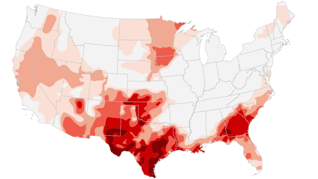 January 24, 2012
 January 31, 2012
 February 7, 2012
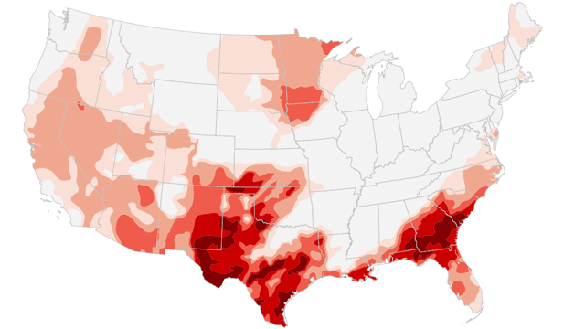 February 14, 2012
 February 21, 2012
 February 28, 2012
 March 6, 2012
 March 13, 2012
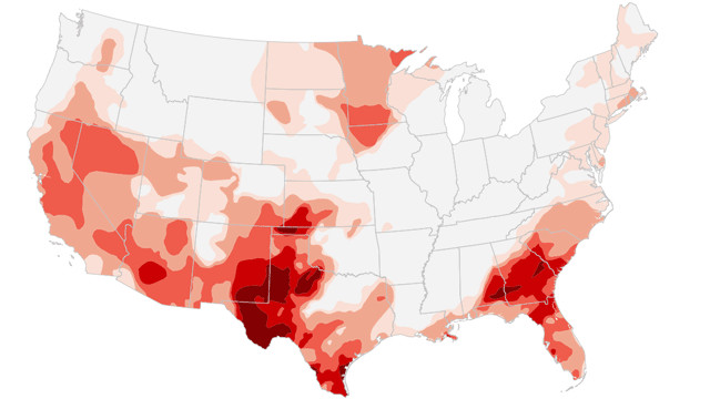 March 20, 2012
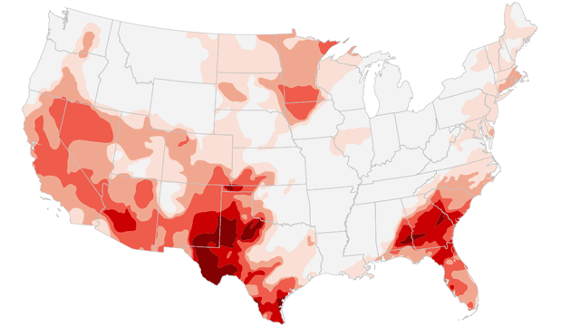 March 27, 2012
 April 3, 2012
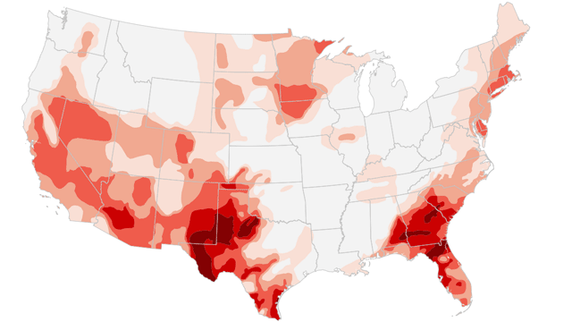 April 10, 2012
 April 17, 2012
 April 24, 2012
 May 1, 2012
 May 8, 2012
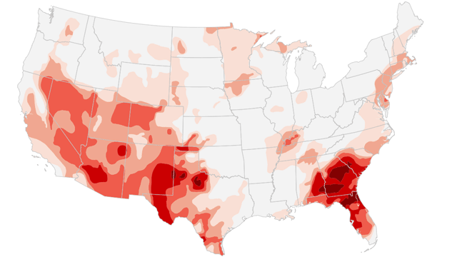 May 15, 2012
 May 22, 2012
 May 29, 2012
 June 5, 2012
 June 12, 2012
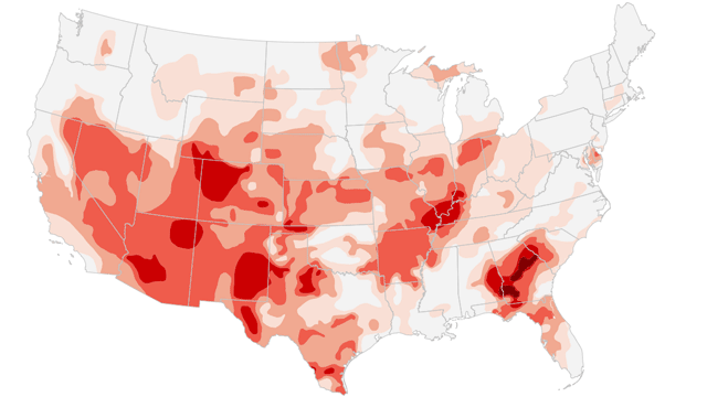 June 19, 2012
 June 26, 2012
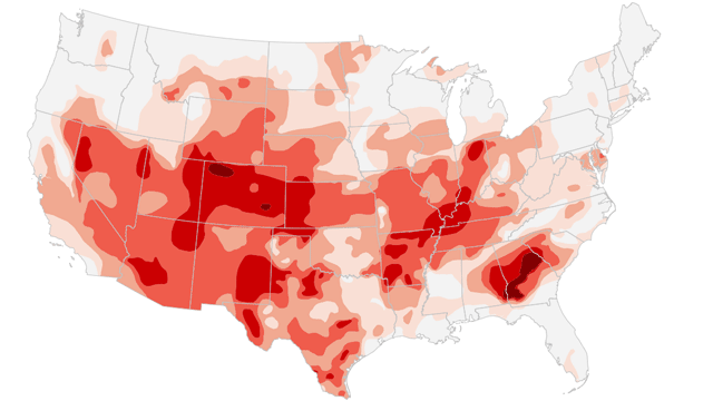 July 3, 2012
 July 10, 2012
 July 17, 2012
 July 24, 2012
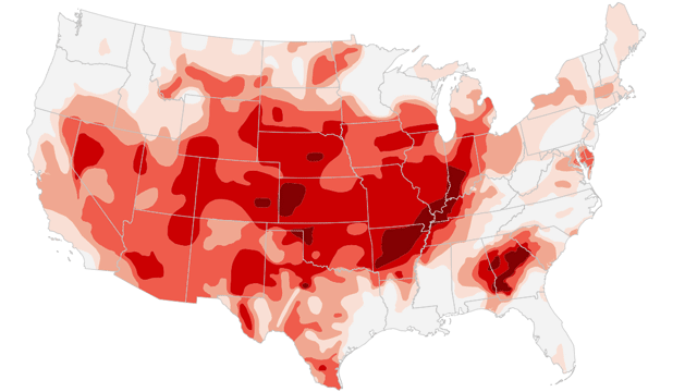 July 31, 2012
 August 7, 2012
 August 14, 2012
 August 21, 2012
 August 28, 2012
 September 4, 2012
 September 11, 2012
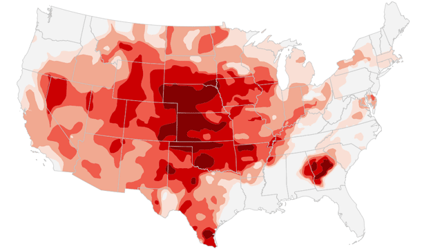 September 18, 2012
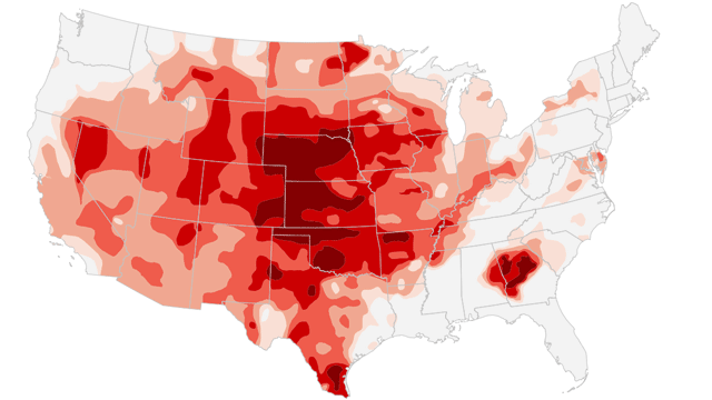 September 25, 2012
 October 2, 2012
 October 9, 2012
 October 16, 2012
 October 23, 2012
 October 30, 2012
 November 6, 2012
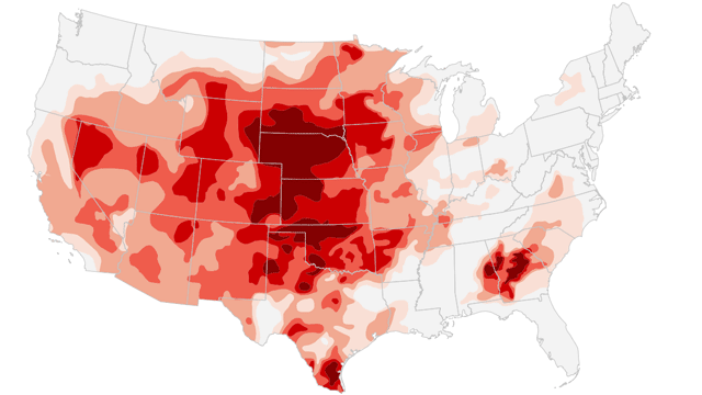 November 13, 2012

Drought intensity levels
Abnormally dryShort-term dryness or lingering water deficits | |
Moderate droughtSome crop damage; imminent water shortages | |
Severe droughtCrop losses likely; water shortages common | |
Extreme droughtMajor crop losses; widespread water shortages | |
Exceptional droughtWidespread crop losses; water emergencies |
Source: U.S. Drought Monitor
What does drought look like where you live? Share your images with CNN iReport.