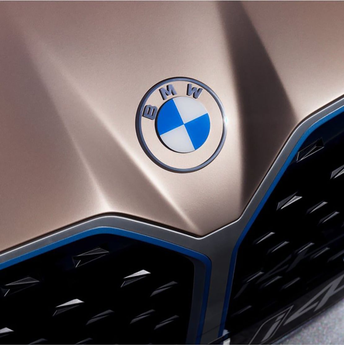
BMW’s round logo is receiving its first redesign in more than two decades.
The German automaker’s refreshed logo ditches the black ring for a transparent circle. The rest of it, including the typeface, has a flatter and more modern look. The blue and white emblem inside the ring remains.
The new logo, which will be used in BMW’s communications efforts, including its social media platforms and website, is meant to “radiate more openness and clarity,” Jans Thiemer, BMW’s senior vice president of customer and brand, said in a statement on the company’s website. He added that the new look also symbolizes BMW’s “significance and relevance for mobility and driving pleasure in the future.”

A spokesperson said there are “no plans” for the new logo to appear on production vehicles, although BMW emblazoned it on the hood of its Concept i4 vehicle, a electric car aimed at Tesla (TSLA) that made its debut Tuesday. The company said that the transparent design gives the car’s exterior color “even greater prominence.”
BMW’s previous logo made its debut in 1997. The company has had six logos in its 103-year-old history, all of them largely similar.
Fans have long speculated that the inside of the most recent logo represents a propeller, but BMW explained that the white and blue pattern in fact represents its German home state of Bavaria. The “propeller myth,” as the company described it on its website, originated from the company’s old ads that promoted its airplane engines.
Doug Sellers, executive creative director for design firm Siegel+Gale, told CNN Business that the new logo is an improvement and that it feels “more open and accessible” to younger customers that are digitally savvy.
BMW is the second German automaker within the past six months to unveil a new look. Volkswagen (VLKAF) premiered a flat logo at the Frankfurt Auto Show, saying it was the “right time to make the new attitude of our brand visible to the outside world.”


