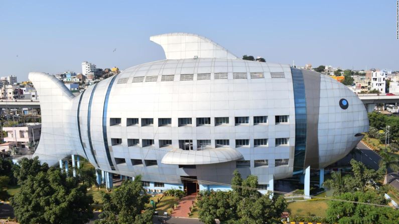


The typical government office is unremarkable and nondescript, its purpose unknown to the outside world. Not so with the National Fisheries Development Board (NFDB) in Hyderabad, India.
Built in 2012, the giant fish-shaped building looks like it is swimming in mid-air. Rectangular scale-like windows puncture its silver body, while a hollow mouth has been punched into the front and it has blue glass for eyes. Its address, according to Google, is the “Fish Building.”
The three-story, 1,920-square-meter structure was designed this way by the Central Public Works Department of India for the simple reason that the work done inside relates to fishing.
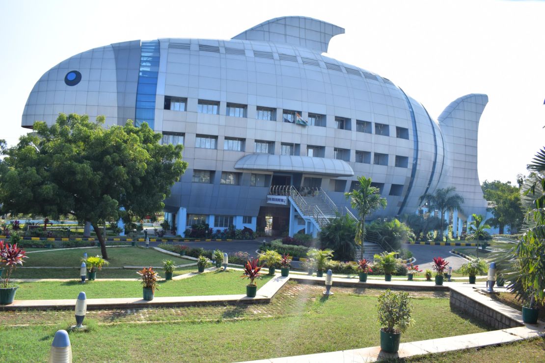
“As Hyderabad is the head office of India’s fisheries department, the government wanted it to be unique. It’s a great building, particularly for a government office,” says Shri MS Siddhartha, a manager at the NFDB.
Images of the NFDB have gone viral globally, and it is considered one of the biggest, boldest and crudest examples of mimetic architecture.
What is mimetic architecture?
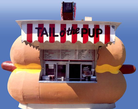
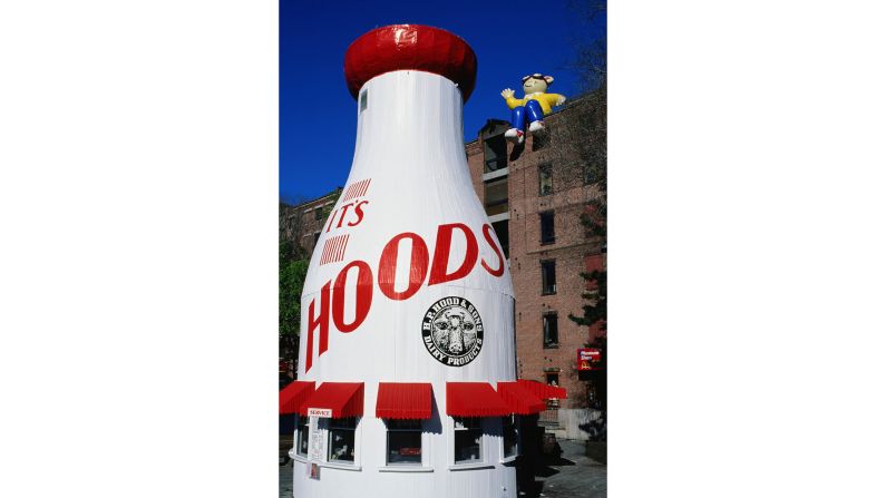
Mimetic architecture – a structure built in a form that mimics its function – became popular in the United States in the early- to mid-20th century.

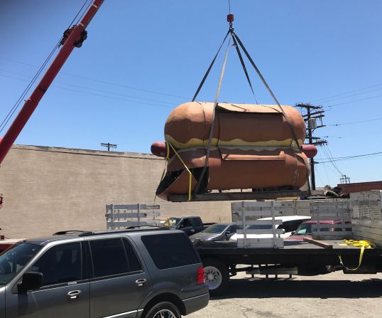
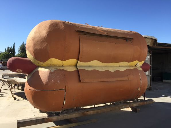
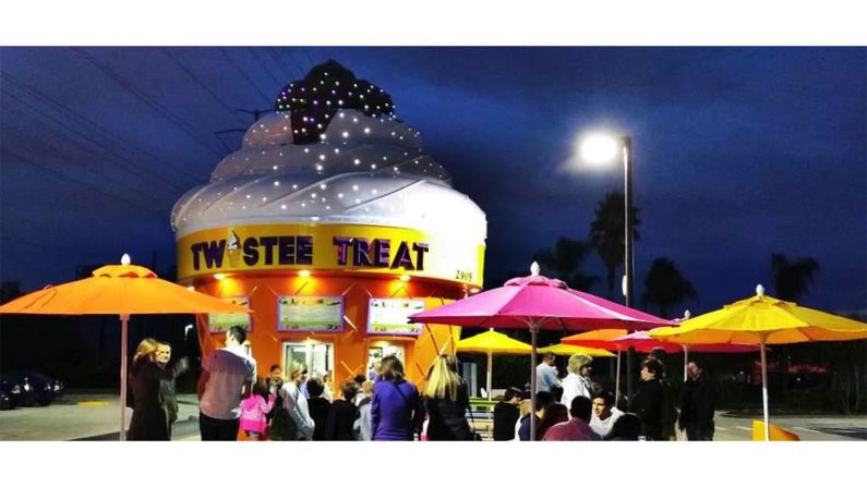
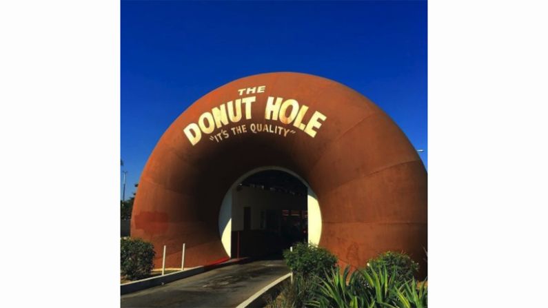
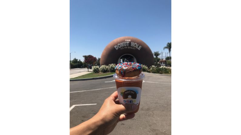
As highways and freeways were being built across the country, drivers began to notice hot dog restaurants in the shape of dachshunds, coffee shops styled as giant cups and donut-shaped stores selling … well, donuts. It was a form of direct marketing that was easily seen by increasingly mobile Americans who were spending longer in their cars.
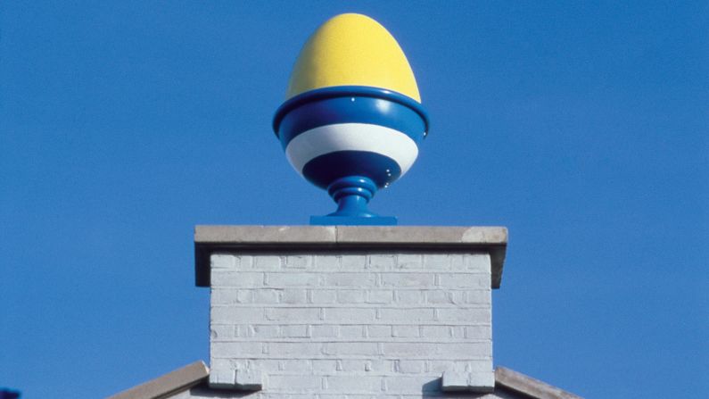
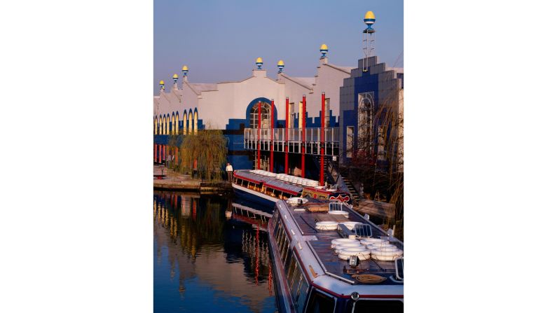
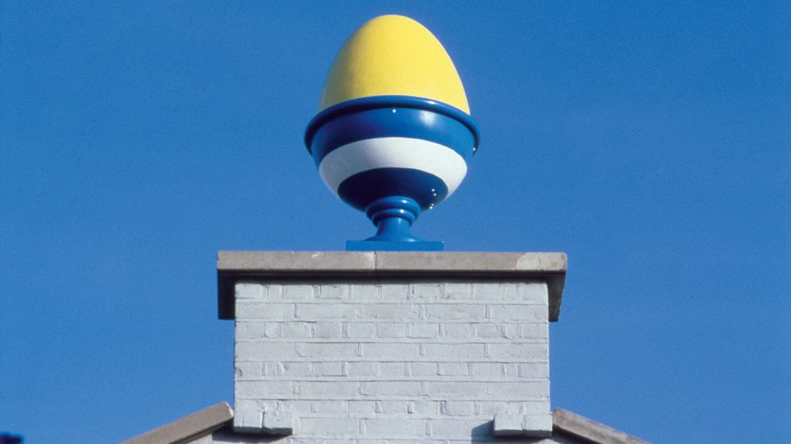
“Mimetic architecture is often derided as a joke, kitschy and superficial,” says Sir Terry Farrell, founder of London-based Farrells architects. Farrell was the mastermind of a 1981 egg-cup-shaped morning TV studio in London, where the eggcups on the roof symbolized that the show was broadcast at breakfast.
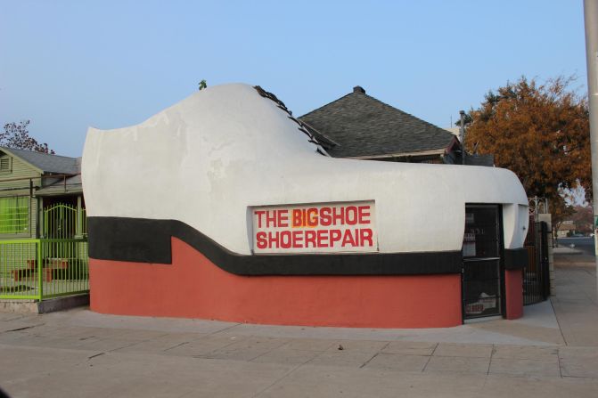
“But there is more to it that than that,” says Farrell. “Driving down a highway, we instinctively know that an oversized orange is most likely (a store that will) be selling oranges; a super-sized shoe probably (is a store that) does shoe repairs; and that a gigantic guitar (is a store that) sells guitars.
“Mostly though, in America at least, mimetic architecture pertains to food. Ironic then that it is seen as bad taste.”
“Ducks” versus the “decorated sheds”
In their 1972 book “Learning From Las Vegas,” architects Robert Venturi and Denise Scott-Brown labeled these types of mimetic buildings “ducks”. That term derived from a giant white duck in Long Island, New York, that was set up by a farmer to sell ducks and eggs.
Their book, a critique of modern architecture, split buildings into two kinds: the self-referential “duck,” and the “decorated shed,” which was a utilitarian structure with added signs to advertise its function. The book, which looked at the architecture of the Las Vegas Strip, “was a reaction to the modernists’ stripping down of all detail and embellishment,” says Henry Squire, founder of London-based architects Squire and Partners, the firm behind the Chelsea Barracks masterplan and the Bulgari Hotel in London.

Venturi and Scott-Brown were critical of modernism’s functional, undecorated “black boxes.” Their book advocated a move towards a more literal and decorative style of architecture, with buildings anchored in a particular place and time, and loaded with signs and symbols. In this sense, the pair were precursors to the postmodern movement, which advocated architecture that was fun, decorative and reflective of the context in which it was built – much like the “ducks.”
“They put a word to a movement,” adds Squire. “It was about throwing out the machine age and finding things in everyday life that were interesting. It was a move away from the abstract and functional.”
Beyond highways
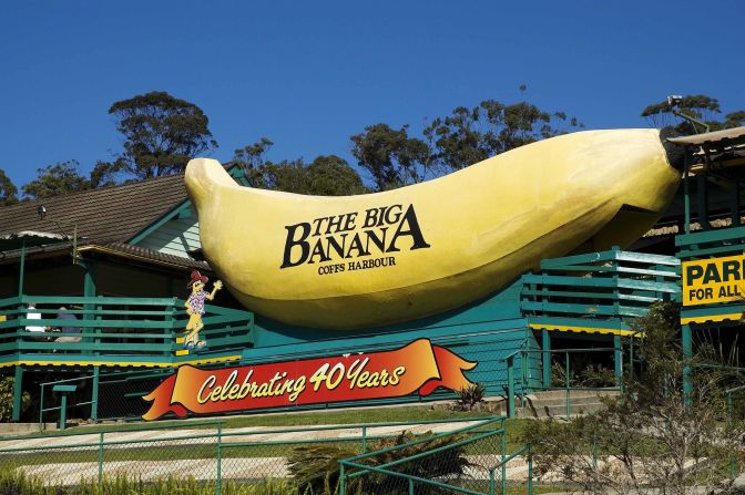
As postmodernism became more widespread across the US, the “ducks” left the highways and became gimmicky tourist attractions in American cities.
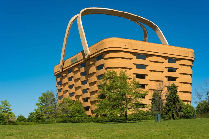
Venturi and Scott-Brown couldn’t have imagined that a “duck” would end up as a company headquarters, as in the “big basket” of Ohio, the one-time headquarters for Longaberger Company – a home décor firm that primarily made baskets. For years it was an eye-catching and gimmicky tourist attraction; now the architectural behemoth is empty and looking for a buyer.

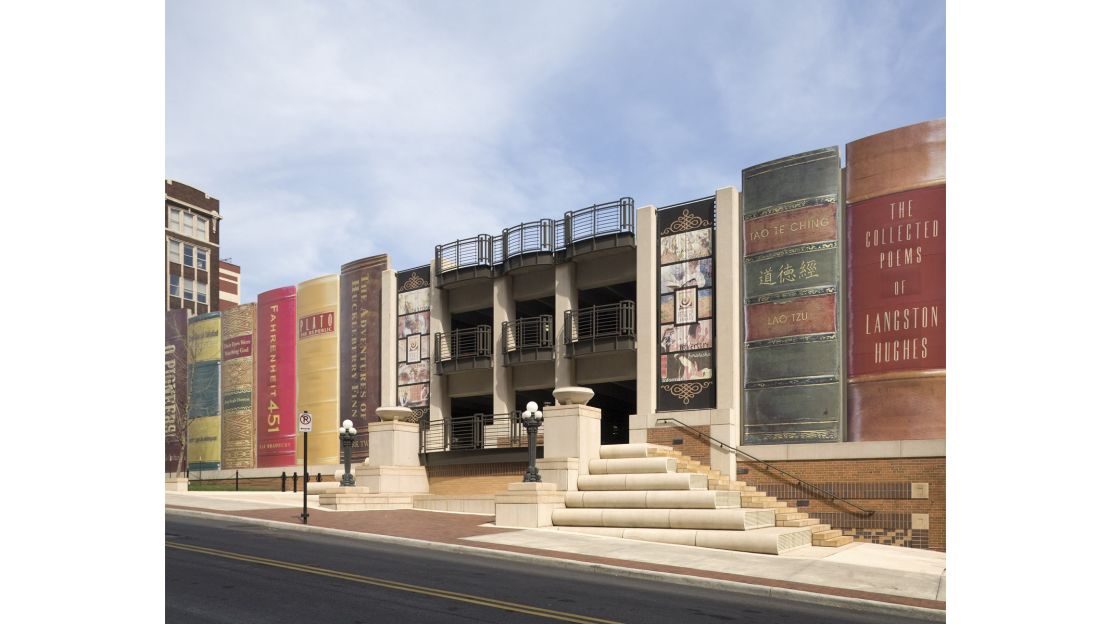
Then there’s the Kansas City Public Library’s parking garage, completed in 2004 and designed to look like a giant bookshelf. It amplifies the community element of mimetic architecture: the 42 titles exhibited were all chosen by Kansas City locals.
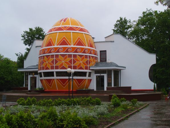
In Europe, in the southern Ukrainian town of Kolomyia, is the Pysanka Museum, which is styled as a 13.5 metre-high traditional Ukrainian pysanka (that is, an Easter egg). Designed in 2000 by architect Igor Shumin, the museum – at 10 meters in diameter – is the largest pysanka in the world, and houses more than 12,000 egg exhibits.
Mimetic goes upmarket
Today mimetic architecture is often dismissed as too kitsch or tacky to be taken seriously. But some mimesis is subtler, using understated motifs to hint at a building’s function.
Take Tokyo’s Asahi Beer Headquarters. The 22-story Asahi Beer Azumabashi Building in Asakusa, designed by Nikken Seikei and completed in 1989, is engineered to resemble Asahi’s top export: beer.
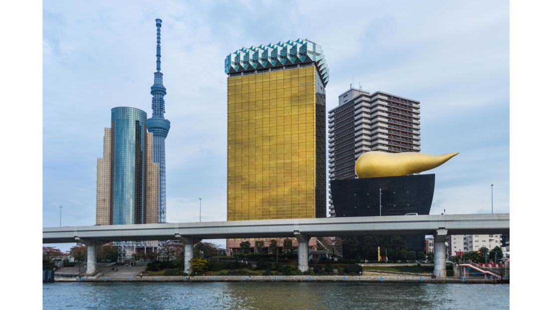
The amber glass conveys the beer, while the slanting white panels at the top mimic the head. Next door is the eye-popping Asahi Super Dry Hall. Designed by French designer-architect Philippe Starck, the 1990 squat black building on the Sumidagawa River has a 300-ton golden flame rising from the top, which some note looks like the fizz from a freshly poured beer. In Tokyo this building is (affectionately) referred to as the golden poo or the golden turd.
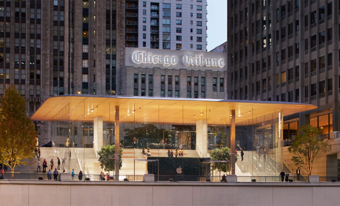
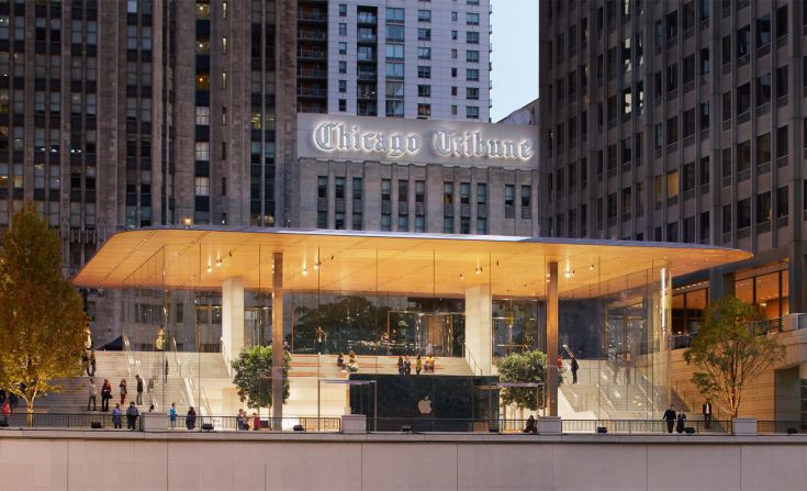
In October, Apple unveiled its Chicago Michigan Avenue store. With a floating carbon fiber roof connected to glass walls, from above it looks like a MacBook cover. According to Stefan Behling, head of studio at Foster + Partners, the design of the new Apple store embodies the architecture studio’s core beliefs: “great urban life, creating new gathering places and connecting people in an analog way.”
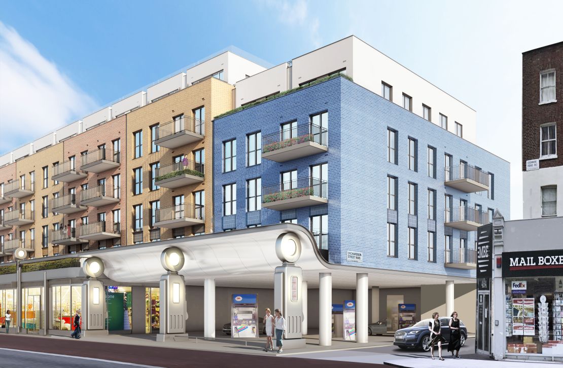
Meanwhile, Farrell is currently working on the subtly mimetic Lyons Place development, an old gas station rethought as residential units on London’s Edgware Road. Three large 1930s gas pumps serve as “playful contemporary monuments” to the building’s original purpose.
“People will continue to use buildings as signs,” says Squire, of the future of this type of design. “It’s still a form of branding, and in this commercialized world you (brand either) by designing an icon like London’s Shard or you make your building an advert.
“If it’s good it can be wonderful, humorous and unique. If it’s bad, well, it’s just a bad advert.”